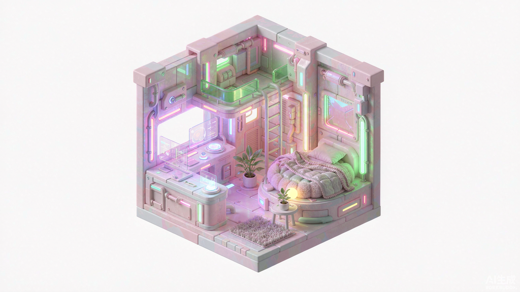
Some aesthetics date faster than others, which is exactly why vaporwave keeps coming back. It was born as a joke about the future, aged into a genuine design language, and now reads as nostalgia with enough polish to carry a brand. For album covers, podcast artwork, and event flyers, the cyan-and-magenta palette is instantly legible at thumbnail size in a way most palettes are not.
What separates convincing vaporwave from a generic neon landscape is the specific set of props. The grid horizon, the wireframe sun, the chrome reflection, the CRT haze, and the Roman bust are not decoration — they are the visual vocabulary that makes the style legible. Leave out the sun and it becomes a normal sunset.
Retro 1980s vaporwave scene, perspective grid highway stretching toward a glowing wireframe sun, chrome reflections, magenta and cyan neon sky, palm tree silhouettes, CRT scanline haze, retrocomputing hardware resting on the asphalt, digital sunset gradient, cinematic wide shot, hyper detailed --ar 16:9 --v 7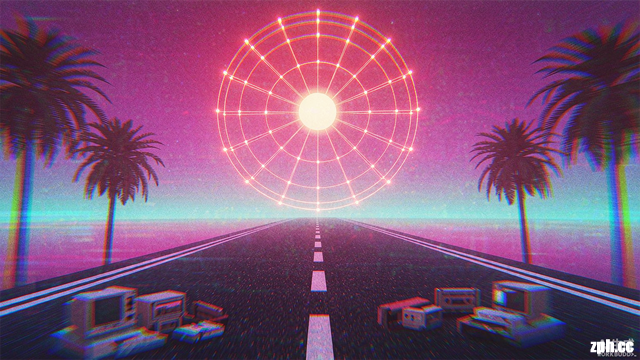
How to Maximize the Results
- Model Version:
--v 7without--style rawkeeps the saturated glow that defines the genre. Add--style rawonly if you want a colder, more restrained version. - Aspect Ratio:
--ar 16:9fits podcast banners and YouTube art. Use--ar 1:1for album covers on streaming platforms, where square is mandatory. - Customization: Replace the grid road with
a neon swimming pool,a marble staircase, oran empty highway over the ocean. Keepwireframe sunin the description — it is the single element that signals vaporwave faster than any colour choice.